MacOS 26’s new icons are a step backwards.
On the new MacOS 26 (Tahoe), Apple has mandated that all application icons fit into their prescribed squircle. No longer can icons have distinct shapes, nor even any fun frame-breaking accessories. Should an icon be so foolish as to try to have a bit of personality, it will find itself stuffed into a dingy gray icon jail.
The left side of the example below shows the old icon for Audio Hijack as it used to appear, while the right shows it rotting away in a Tahoe prison cell:
While Apple had previously urged developers to use squircle icons on our apps, they’ve now taken things much further to ensure compliance. It’s a shame.
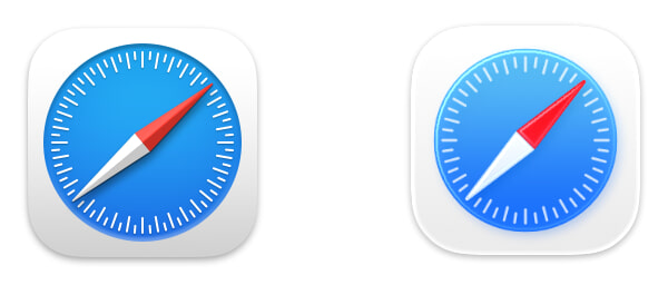
Apple updated their own app icons on Tahoe, for both the squircle shape as well as the new “Liquid Glass” interface. Mostly, these icons seem dumbed-down, with a loss of detail. For example, here’s Safari’s old icon from MacOS 15 (Sequoia) on the left, and the new Tahoe icon on the right:
To me, the new icon just feels blander, and that’s widely true for all of the updated icons. A small number, such as Screen Sharing and Audio MIDI Setup, may be improvements. Most, however, are not. Let’s review with direct comparisons, all of which again feature the older Sequoia icon on the left and the new Tahoe icon on the right.
There are a few lateral moves:
Image Playground
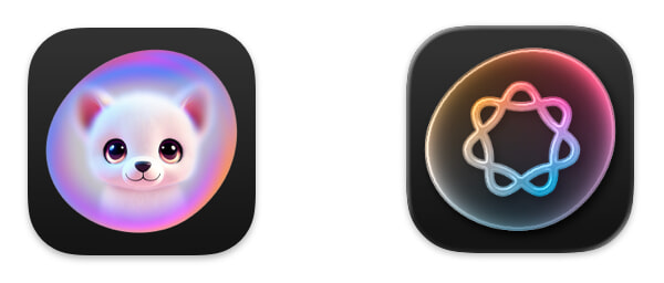
Image Playground is Apple’s AI image generation app, though its new icon doesn’t really convey that. At least they got rid of that awful catdog.
Photo Booth
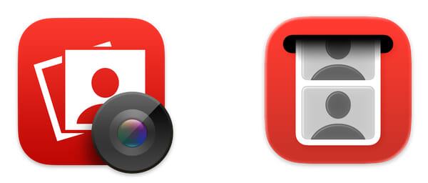
I like the new concept for Photo Booth’s icon, but the execution is lifeless.
Mission Control
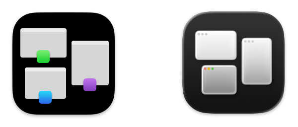
Meanwhile, Mission Control’s functionality is a difficult concept to convey. I liked the old color indicators, but the new version at least includes the window control buttons.
Unfortunately, however, there are many new icons which are distinct downgrades.
Automator
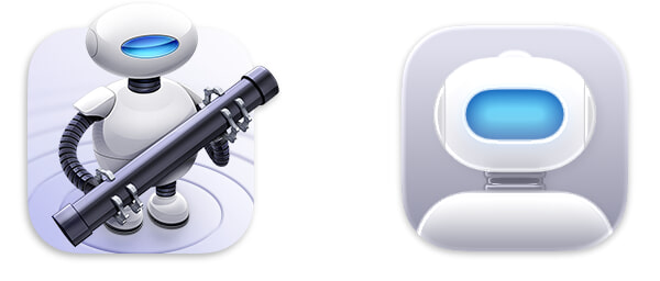
Apple’s scripting application previously featured an awesome little robot dude. On Tahoe, it’s barely clear that’s a robot at all. What a pity.
Calendar
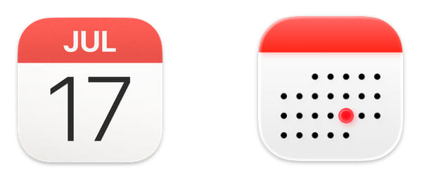
I remember that 30 days hath November, April, June, and September. And I thought all the rest had 31, except February, which has 28, except in a leap year when it has 29. Which month is it that has 24 days?
Chess
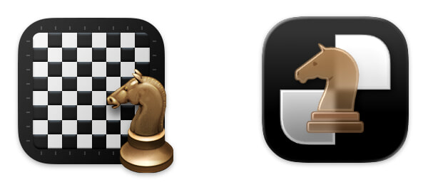
This is just really bad. The board has been zoomed-in to the point of meaninglessness, while the glass knight looks fuzzy and amateurish.
Contacts
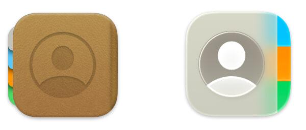
The left-side tabs on the old Contacts icon were odd, but this new icon is even odder. Is the cover of that book made of glass?
Font Book

Hey, look, it’s Contacts, but far worse! This no longer looks like a book at all. It’s just a gray “a” blob.
Disk Utility
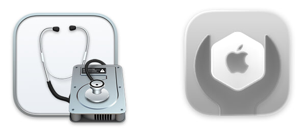
Several of Apple’s new icons for utilities feature the dumb wrench seen on the right, but this is one of the worst. In this case, the Apple hexagon the wrench is adjusting utterly fails to convey “disk”.
Migration Assistant

Hey, speaking of icons that are now utterly devoid of meaning.
DVD Player
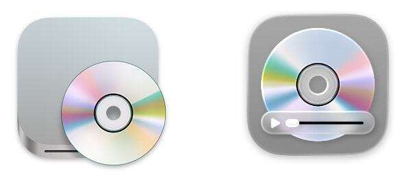
I am both amused and aghast that Apple spent time updating this moribund application. For reference, it’s been over nine years since Apple last sold a Mac with an internal optical drive.
Image Capture
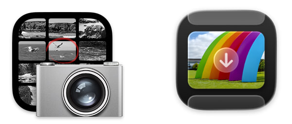
The old Image Capture icon was no great shakes, but the arrow on the new one really threw me off. I honestly thought the new icon had not fully loaded.
Preview
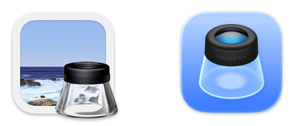
Look at the beautiful photorealistic glass on the loupe in the old Preview icon. They sucked the soul out of it, and ironically, the new Liquid Glass version barely looks like a loupe at all.
Stickies
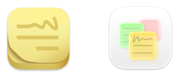
The previous Stickies icon looked perfectly like a pad of sticky notes. The new icon looks like strange glowing glass sheets, hovering in the air.
TextEdit
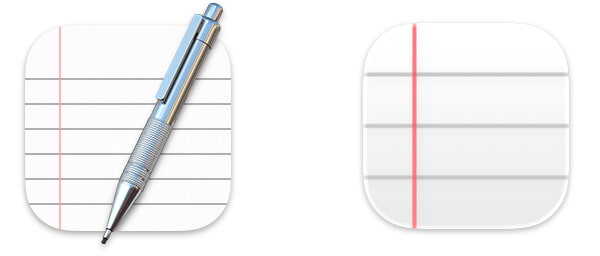
This change is simply awful. In isolation, the new icon is barely recognizable for what it’s attempting to be.
Digital Color Meter
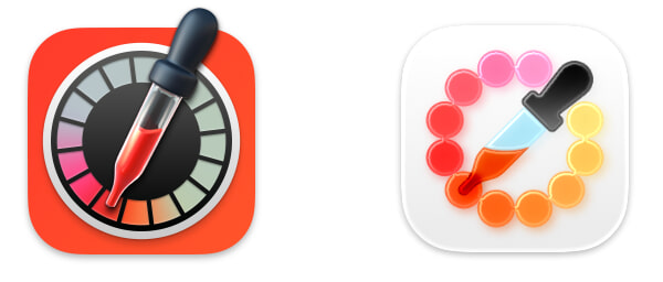
This, however, is my pick for the single worst change. The new icon looks like art from a kindergarten classroom, and this app is not a kid’s toy.
Closing
Overall, Tahoe has been a solid update for me, particularly with the recent 26.1 release. These icons, however, make me sad. Perhaps one day, it will again be possible for icons to have shape and personality. We have the technology.